Here is our full advert below.
We have done a poster version of the wanted poster to have as a give away item with the Digi pak.
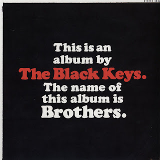
"The black keys" album "Brothers" had a give away poster idea that came with the album and that is where we got the idea from.


Real adverts in magazines come in all different shapes and sizes depending on the budget of the band for example a shared page advert would be cheaper than a full page advert and it just depends on what magazine it is as well for example if its in a local magazine or a top magazine like kerrang or NME.

With our research into album adverts we found that there are less and less adverts in magazines but more and more concert and festival adverts so this might suggest that the bands make more money from concerts and festivals than from CD sales.
We have also designed playing cards with the characters faces on which would be a free give away item when the digi pak album is bought. We went for the approach of gambling and it being bad to go with our theme of crime even though gambling is legal but in the eyes of the church it is bad and we thought it would be appropriate as we do use a priest in our music video.
With our front cover as well as the inside cover they compliment each other with different aspects. As the front and back cover have no similarities to the inside cover and it offers a totally different idea as i have mentioned earlier in my blog that i wanted to do.


