OCR Media Studies - H540 (2010/11)
Tuesday, 29 March 2011
Wednesday, 12 January 2011
What certificate to give our music video
Thursday, 6 January 2011
How did you use new media technologies in the construction and research, planning and evaluation stages?
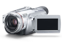
 For construction we used the NVS5 500 mini DV camera that had a the ability to manipulate white balance and and depth of field so that we could experiment with what we wanted to include in our music video. For post production we use the Imac and the software on it was adobe premiere pro cs3 which enabled us to construct our footage in a linear order as well as manipulate the speed of a certain scene either to increase or decrease the speed so we could experiment to what we wanted. We also used a Nikon coolpix L12 camera to get possible location shots for our music video. We also used the green screen in the News room part of the music video and this enabled us to create our own interpretation of a newsroom. We used Photo shop to do this and we could manipulate the shape of the image and we made it looked curved and obscure so that it made the audience focus on the news reporter.


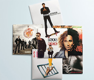
For research we used Youtube to research other music videos and see other conventions that is the norm for music videos and we could make constructive decisions whether to break away from these forms and conventions from the research we got from Youtube. We also used blogger to the best of our abilities and we used it to show the research that we found and used it as a form of medium to do this, it enabled us to put all our information that we found out in easy to read blogs. We also used google to find as many different posters and album covers as we could relating to the type of genre of music we had chosen.
I also used myspace to get hold of the band and ask them if we could use their song for our music video.
 For our planning we used our blog to set out an itinerary to show us what wee needed doing and when. we also used Google maps to help us find other possible locations and we also could use street veiw on google to see what good places we could do band shots or other narrative shots. We used our mobile phones to get in contact with each other to set up filming dates and orginising where to film, we also used facebook for the same communication reason.
 For the evaluation of our music video we created a questionnaire on Word which we then gave out to about 10 people to fill in so we could record their veiws at the screening of our music video. To show our music video we used a projector in the media studies room and we got everyone their by also making a poster on word to let everyone know were its going to be shown and what time its going to be shown.
We were going to use our give away poster as the invitation poster but we wanted it to be a surprise for the fans when they bought the Digi pak disc.
What have you learned from your audience feedback?
Here is the questionnaire that we gave out to a few students before even creating our music video.
We have made a questionnaire to find out what our target audience and what they expect from a music video of their favorite genre of music.

Here are the results of my questionnaires.
1. Age:
16-1
17-8
18-3
2. Favourite Genre (more than one choice):
Rock- 3
Jazz- 0
Alternative Rock- 5
Metal- 0
Pop-2
R&B- 4
Country- 0
Other- 3
Nu-Soul
Folk
Most things
3. What type of music video?:
Funny-8
Sad-1
Exciting-2
Thriller-1
Action-1
Adventure-0
Other-2
Epic
Good ones
4. What do you like to see in a music video?:
Originality-9
Special Effects-3
Band shots-5
A storyline-4
Extreme angles-0
Band Promo-0
Other -0
5. How is it consumed?
Online-4
Radio-5
Music channels-7
iPhone or iPod apps-0
Download-9
CD's-3
Other-1
All
6. Is there any music channels you like to watch?
Yes-9
No-3
If yes please state-
Viva
Kerrang x 3
NME
MTV Base
Kiss x 2
MTV
Hits
T4
4music x 2
Skuzz
Thank you for filling out our questionnaire.
From the results we could determine that most people prefere Alternative rock and the second favourite was RnB. In question 3 it also seems that people prefer music videos to be funny rather than any other genre. Question 4 also it seems people like to see originality in their music videos as well as band shots and i also think band shots are expected as it is a convention that nearly every music video follows. In question 5 it seems that most people consume their music by either downloading through the Internet or by watching music channels. I think over all our results would be a lot more accurate if we had more people as well as a varied age range and gender as i think our results were good but we only had 3 males and 7 females so it was not as accurate as it could off been.
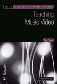
In Adrew Goodwins book on the rise of MTV, he mentions key points that can relate toour music video for example "There is a realationship between the lyrics and the visuals (with visuals either illustrating, amplifying or contradicting the music), There is a relationship between the music and the visuals (again with visuals either illustraiting, amplifying or contradicting the music), Particular music genres may have thier own music video style and iconography (such as live stage performance in heavy rock), there is a demand on the part of the record company for lots of close-ups of the main artist/vocalist, The artist may develop their own star iconography, in and out of their videos, which, over time, becomes part of their star image, There is a likely to be a reference to voyeurism, particularly in the treatment of women, but also in terms of systems of systems of looking (screens within screens, binoculars, cameras, etc), There are likely to be intertexual reference, either to other music videos or to films and TV texts." taken from BFI education book by Pete Fraser, these points distinguish the music video as a form. Knowing all these points it also helped us to create out musiv video to fit with coventions that the audience expect and this helped us also if we wanted to break these conventions.

Here is the second questionnaire that we did after we showed the music video.
1. Male Female
2. Age
15 16 17 18+
3 What is your favourite music genre? (multiple choice)
R&B Dance Rock Alternative Metal Pop Indie Jazz Country Other
If other please state.........................................................................................................................................
4. Do you think that our music video portrayed the message of the song?
Yes No
5. What do you expect to see in a music video?
Social effects Band shots Slow motion Storyline Animation Close ups Band members playing as the characters Other
If other please state.........................................................................................................................................
6. Did you think that having 3 people play all of the characters in our video a good idea?
Yes No
7. Do you think the mix of humour and adult themes worked?
Yes No
8. Did you find our video offensive?
Yes No
Below is the results of this questionnaire
1. Male-10 Female-11
2. Age
15 16-2 17-13 18+-6
3 What is your favourite music genre? (multiple choice)
R&B-13 Dance-6 Rock-8 Alternative-10 Metal-3 Pop-10 Indie-15 Jazz-2 Country-3 Other-1
If other please state- "Filthy Dubstep"
4. Do you think that our music video portrayed the message of the song?
Yes-19 No-2
5. What do you expect to see in a music video?
Social effects-6 Band shots-15 Slow motion- 4 Storyline-14 Animation-3 Close ups-7 Band members playing as the characters-11 Other
If other please state.........................................................................................................................................
6. Did you think that having 3 people play all of the characters in our video a good idea?
Yes-21 No
7. Do you think the mix of humour and adult themes worked?
Yes-21 No
8. Did you find our video offensive?
Yes No-21
With this questionnaire we had a lot more people so the results were more varied and accurate. We can also see that most of the people that came to watch our music video liked indie music as well as RnB music. We also found out that people who came to watch our music video also had a varied taste in music as the majority of people put more than one favourite type of music. It also seems that some 19 out of 21 people thought that our music video portrayed the message of the song this can be linked to Stuart Hall's Receptionist theory with encoding and decoding and how audiences decode media in all different ways. A lot of people do expect to see band shots and a storyline as well as close ups and these conventions are expected and there is evidence of that with the results we have got. We also found out by breaking the convention of using the same person to play different characters was a good idea according to the audience and that the mix of humour and adult themes worked. With this combination we found that no one was offended by the issues that we raised in our music video.

How effective is the combination of your main product and ancillary text?
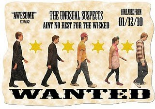
Here is our full advert below.
We have done a poster version of the wanted poster to have as a give away item with the Digi pak.
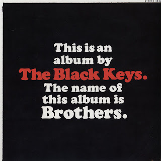
"The black keys" album "Brothers" had a give away poster idea that came with the album and that is where we got the idea from.

Real adverts in magazines come in all different shapes and sizes depending on the budget of the band for example a shared page advert would be cheaper than a full page advert and it just depends on what magazine it is as well for example if its in a local magazine or a top magazine like kerrang or NME.
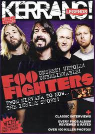
With our research into album adverts we found that there are less and less adverts in magazines but more and more concert and festival adverts so this might suggest that the bands make more money from concerts and festivals than from CD sales.
We have also designed playing cards with the characters faces on which would be a free give away item when the digi pak album is bought. We went for the approach of gambling and it being bad to go with our theme of crime even though gambling is legal but in the eyes of the church it is bad and we thought it would be appropriate as we do use a priest in our music video.
With our front cover as well as the inside cover they compliment each other with different aspects. As the front and back cover have no similarities to the inside cover and it offers a totally different idea as i have mentioned earlier in my blog that i wanted to do.
In what way does your media product use, develop or challenge forms and conventions of real media products?
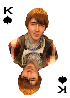
With the band shots that we used in our music video i think we automatically broke away from Andrew Goodwin's star theory as the main character was the drummer at the back and there was no lead or main singer at the front during the band shots. This tends to symbolize that every member is important in a band and sometimes the lead person in the group should step back and let the other members get involved more. That is another reason why we as a group did all the shooting and acting ourselves but just dressed up as different characters every time as this also symbolizes that we did it differently than normal music videos and we worked as a team letting everyone be in the spot light not just the main character. The notion of our group all needing each other to function is brought to light with our front cover monster idea as we all are split up to make up a completely different person to give the representation that we rely on each other do get things done.
We also used fake instruments all the way through our music video in different locations and we re used them every time just like we re used our selves for different characters in our music video to show that you can't judge things at face value as they may have many talents and with the instruments in the fact that a card board box can be many things to different people and may be used for different things.
With the camera work that we had planned it was similar to other music videos for example mid shots and close up of band shots as seen in other music videos such as Blink 182 "I miss you" .We used this as it was part of what the audience wanted, but we also challenged realism as we speeded up some shots as well as reversing them. This manipulation of time within our music video might suggest that the characters in the music video have no control over what is happening within the realm of the storyline. But we did try to keep to basic requirements from a music video as a quote from Steve Archer explains "But it is the lip-sync close up and the miming of playing instruments that remains at the heart of music videos, as if to assure us that the band can really kick it."
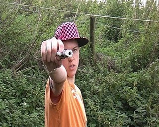
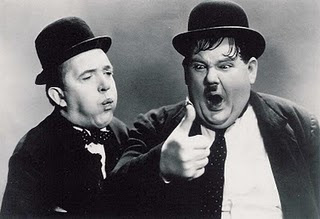
When we were editing our music video we also thought about how to make this narrative element more accessible to the audience as we brought alive the storyline with strong characters such as the vicar or 'champagne' the prostitute as well as special effects and green screening. These all helped to support the genre of music video which has been abstracted from other media art forms like Laurel and Hardy for example. I chose Laurel and Hardy because their movements have often been speeded up and we chose to speed up sections of our music video.
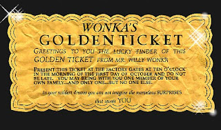 With the collection of these special cards that we would use as a give away item we would help give possible value to the completed sets so that the bigger the fan will receive better rewards for having a bigger and complete set.
As a group we have also challenged a particular aspect which most music videos have and that is we have given our music video a completely linear timeline but in most cases narrative songs in poetry for example are fragmented and this also apply s to music promos. This tends to mean that the story-lines can offer complex fragments in a non linear order that leave the audience wanting to know more of whats happened.
We also realized with music videos we can offer a different experience to the audience compared to a concert as the audience in a concert can not get as intimate as they could to a music video and with this we could offer humorous intimacy.
With the Mise en scene we challenged what is normally expected behavior of a band when playing music in a normal place as we decided it would be a good idea to film in a river then wash our instruments down the river for the sake of our music video. We also used what we had available and at the time was cardboard and a few good rural and urban settings that we used to our advantage to get the best abstract approach in using those locations.
Friday, 17 December 2010
Poster idea change
We have now decided that we could use the poster for the advert as well but adding more detail in with the advert. The style that we have now decided would fit in better with the whole crime genre we have gone for would probably be a wanted poster. So we have started designing the poster around the idea of a wanted poster as well as keeping the abbey road idea in play so we have had to make a compromise between them and create a poster that has a shared idea. Here is a wanted poster and how we might want our music video poster to look.
Finished front cover
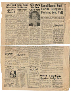
Now that we have finished the front cover we can now work on the inside of the Digipak cover and use the ideas that we have come up with so far. For the left hand side we were also thinking about having an old style newspaper describing what has happened in the music video and showing the report of the incident as the main character as the eye witness and having quotes like "Iv'e never seen so much crime in one day" or " I just cant trust society anymore". Below is an example of the style of newspaper we are thinking of going for.
Vinyl record idea
We have decided to put a vinyl record player on the right inside part of the Digipak cover over the part were the disc is meant to go. We have decided to add this old type of music device to the Digipak cover in reference to the fact that during the time when vinyl records were at its peak the mafia and organized crime was at its prime with the likes of Al Capone in the media. The time from Al Capone through the pop art culture to Bridget Riley was a good place to start when designing the record as we could incorporate her work into the making of the record.

This is one of Bridget Rileys pictures that she created around the 60s era that we could use as part of a design for our record label as well as the checkered design below.

Wednesday, 8 December 2010
Finshed additional fan insert
Here are the five cards so far.
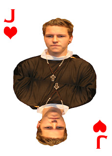
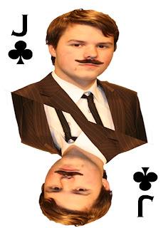
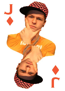

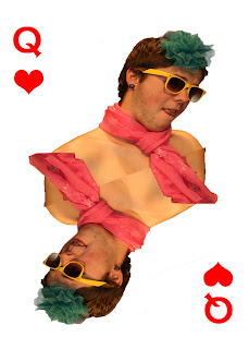
We have also made a design for the back of the cards to make them feel that they would have a better feel to them and also would make them feel authentic.

Friday, 19 November 2010
Creating a poster invitation
Thursday, 18 November 2010
Preparing to show our music video
Now that e have finished our music video we can now show it to an audience, but at the same time we can get audience feed back so today I am going to make a questionnaire so that sometime next week we can show our music video next week and get the results from a questionnaire as well but to do this we are going to have to advertise what time, date and location we are going to show it.
Wednesday, 17 November 2010
Finished editing
Photo shoot extra
Thursday, 11 November 2010
Poster Idea/Advert idea
We have decided to still use the Abbey road idea but use it for either the advert or the poster , we still are thinking about where to have us all standing but all we need is one picture for the background and then the rest of the pictures we can do inside with the green screen.
The background could be a mix and match again but use it form the environments that our individual characters are from and make that as a background.
Monster Photo shoot

We tried to get an array of pictures so when it comes to editing the pictures we have options to play around with.


We have also got some mid shots for the actual monster.
Digi Pak cover so far
Tuesday, 2 November 2010
Key features in music videos
Monday, 18 October 2010
New Digipak ideas
For example what "blink 182" do in their music video "Always".
Another example is the way that these album covers are layered together.
